IBM People App
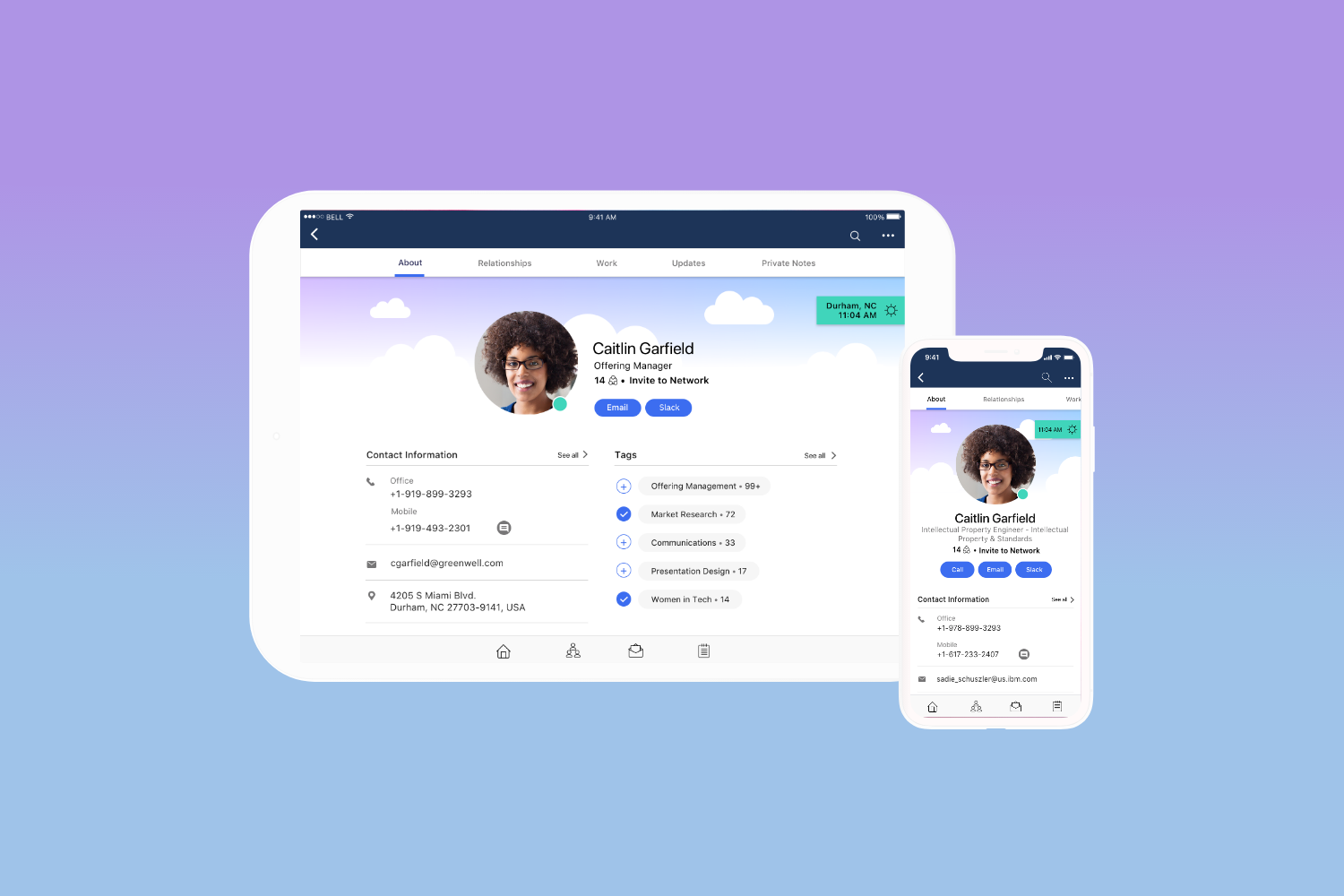
IBM People mobile app is a standalone enterprise directory service that was developed using React Native. With React-Native, it was possible to develop the app once using javascript and view it on both iOS and Android devices. The app would have the look and feel and performance that matched the native platform. The Web and Mobile apps were designed simultaneously to create a holistic experience. I led the design of the mobile experience.
Company: IBM
My Role: Mobile UX Lead
Team: Product Owner, 1 UX Designer, 1 User Researcher, 1 Content Strategist
Discover & Define
The People app started by understanding the user's problems and needs when looking up people from a business context. With several Design Thinking workshops, we were able to define the "user outcomes" and "user stories" that drove the app's user experience.
User Pain Points
"Too much under the people menu and hard to know where to go."
"Not fast enough."
"Need improvement of search."
"Tags are too manual. Use it once and forget about it."
"UX is not intuitive."
"Great content is often hidden." (eg. Things in Common)
"Not enough customization."
Need Statements
Created ad-lib need statements to define the needs for the app.
User Outcomes
The following outcomes were prioritized and defined for the first release of the People app:
Directory/ Search: A user can quickly find the person they want.
Your Profile: A user can quickly get oriented to who a person is and find the content they care about.
My Profile: A user can enhance their own profile, allowing them to curate their online identity.
Create Groups: A user can create meaningful groups and easily access it anywhere in the app.
Business Card: A user can find out about a person anywhere and find the info they need at their finger tips.
Settings: An admin can install and enable extensions to meet a company's needs.
Ideate & Design
Ideation
When we started designing for the people app, we assumed people would benefit from seeing slightly different profile layouts based on their relationships. For example, when you didn't know someone, we wanted to show a large header showcasing their photo and "About" information. Conversely, if you knew somebody, we wanted to reduce the header and elevate the shared content.
Left - Showing a profile you don’t know; Right - Showing a profile you know
After talking to our sponsor users, although they appreciated the new concept, they were concerned about the consistency in layout and content surfaced. We quickly changed course, iterated on our designs to come up with a structure that would be an optimal experience for all relationships types.
We took a mobile first approach and defined the structure of the app and applied it across all platforms to create a seamless and holistic experience. I created the mobile wireframes for phone and tablet.
Profile view of phone and tablet
User Research
User research played a critical role in defining the direction of the People App. Based on sponsor focus groups, we were able to get valuable feedback and continuously iterate and improve on our designs.
Users loved the dynamic header and sticky navigation
Users appreciated the simplified layout and organization of content
Users wanted to see the “relationships” section higher up in the structure
Users found the content order for “relationships” confusing
Users were confused about the dynamic headers based on relationship
In addition to our focus group sessions, we had bi-weekly playbacks to share our designs to a broader group of designers, developers, offering managers and stakeholders to get valuable input as well.
Design System
As a mobile expert, I had the opportunity to be actively involved in building ICS’s Design Language System and we used this as a basis for defining our UI styles for the People app. The details of the creation of the ICS Design Language System is documented here.
Final Designs
Search
My Network
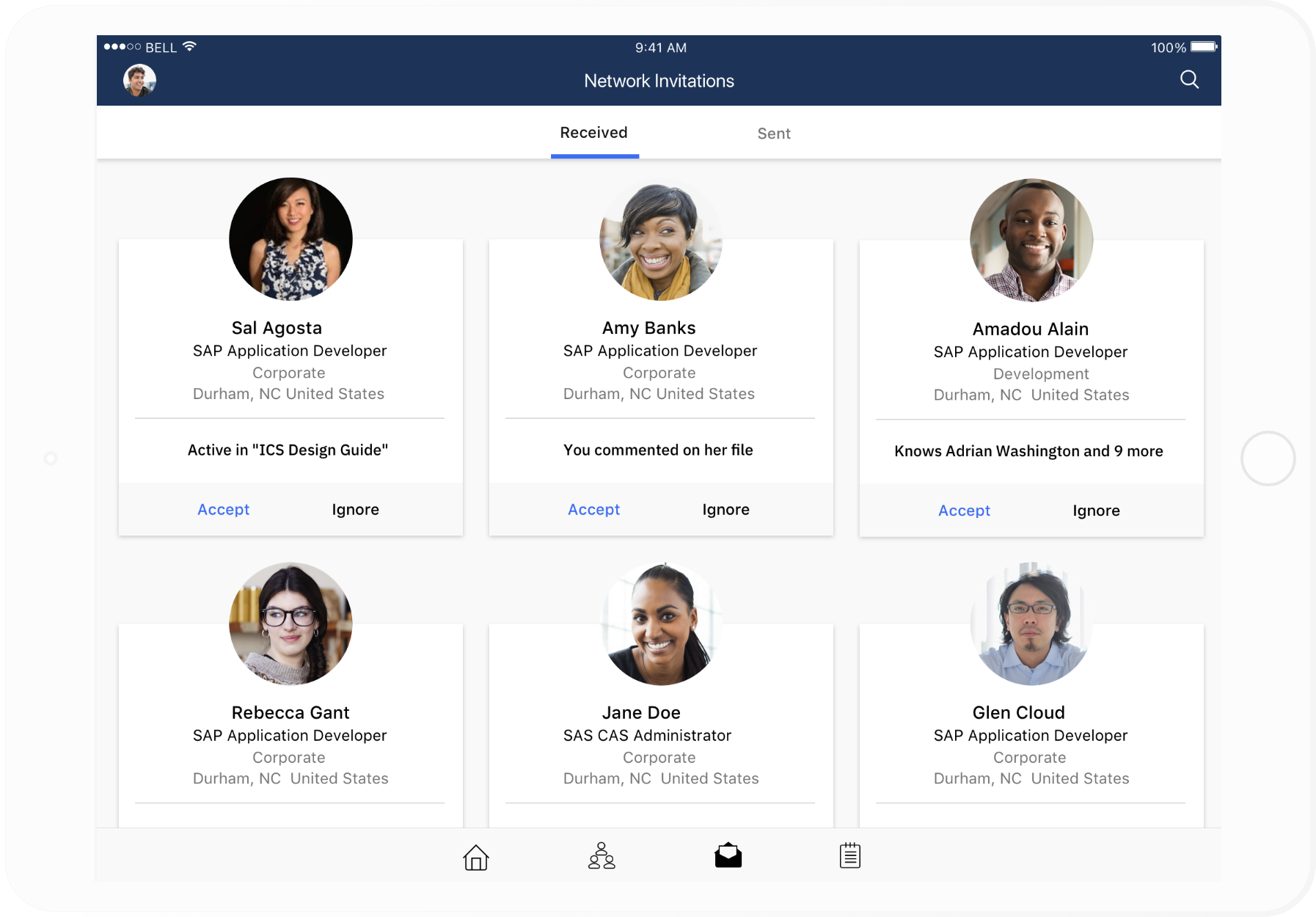
Network Invitations
Notes
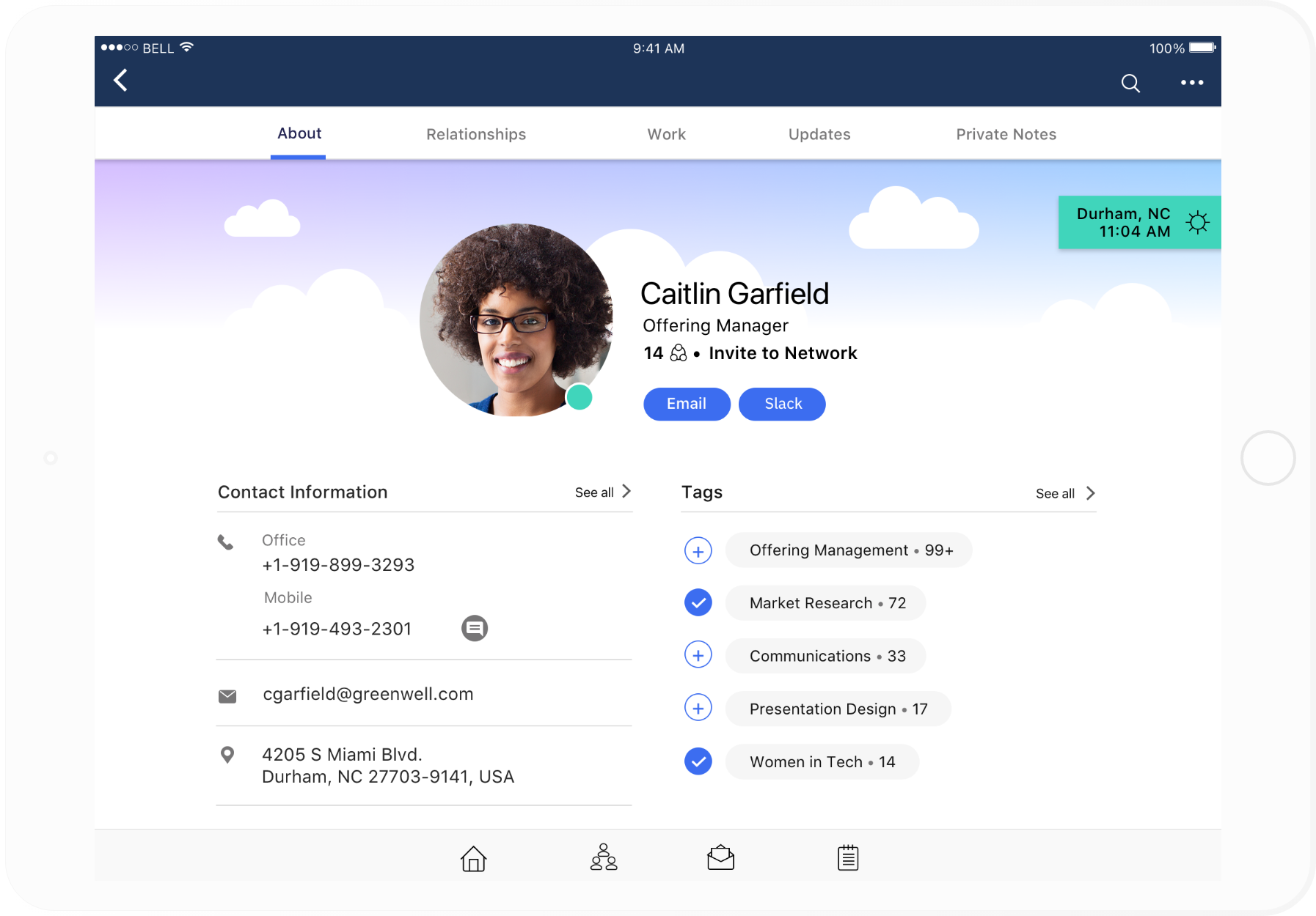
Profile
Profile - Biz Card
Profile - Work
Profile - Updates

Tablet - Network Invitations

Tablet - Profile
Lessons Learned
In a big organization like IBM, it's typical that mobile apps are developed after the Web apps are launched. It was a great experience to see the People App take a true mobile first approach and work side by side with the Web team to come up with the final product. You get a more holistic approach when designing across devices and you could see how the product could evolve for future enhancements.


