ICS Design System
As a mobile expert, I was part of a core team to define the Design Language System for IBM Collaboration Solutions (ICS), the blue print for product development. I was involved in the end to end process of developing the design system and provided mobile expertise along the way.
Company: IBM ICS
Role: Mobile UX Lead
Team: 4 UX Designers, 3 Visual Designers, 1 User Researcher, 1 Writer, 1 Front End Developer
Problem Statement
The challenge that our group was facing was as product teams grew, the process was difficult to manage. What color palette should we use? What typography makes sense on this platform? What metaphor should this icon be? Without a standardized guideline, the inconsistencies across products and platforms continued to grew, leading to inefficient, repetitive and wasted work.
Building the Design System
Personas & Empathy Maps
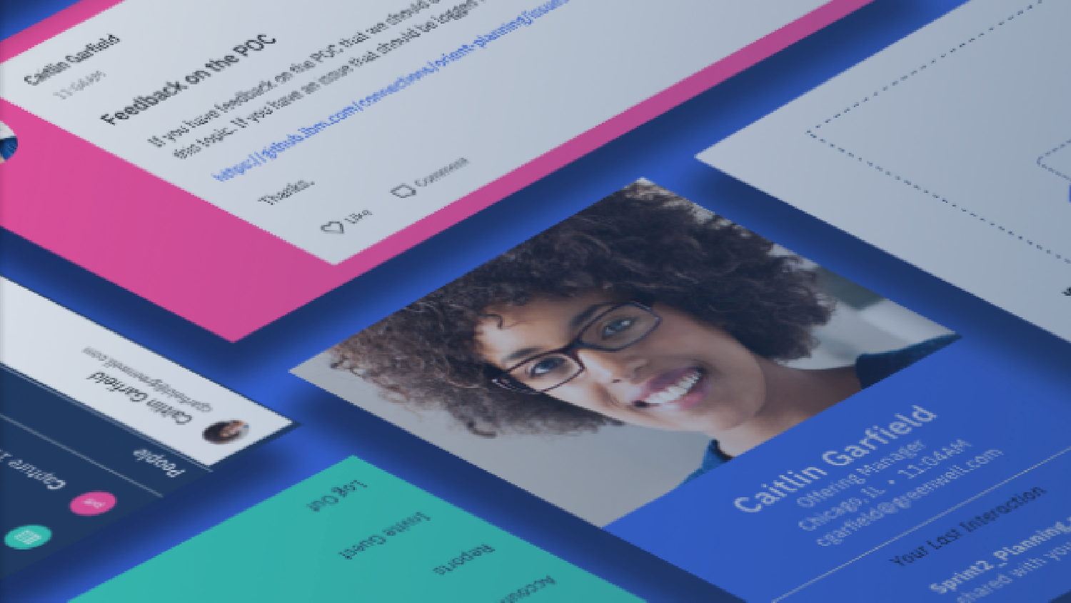
The first step we took in defining the design language system was to understand our users. Each team member was assigned a persona and we put ourselves in the lens of our users and documented their needs and motivations. I was assigned to Caitlin, a visual designer at ICS.
Experience Maps
We documented the different stages of the user's journey based on the personas we defined.
Market Research
I have done extensive market research to find out what the market industry leaders were doing and study what the cutting edge behaviors, design patterns and trends were. I looked holistically across web and mobile and focused on the specifics of individual patterns.
Some of the findings of the research were:
Intentional use of colors - purposeful
Primary actions - clean and simple
Consistent platform - web, tablet and phone
Use of micro-animation - delight and increased usability
Limited palette - essential for brand communication
Trending gradients, illustrations, photography - give dimension and playfulness
A bird's eye view of a partial list of products I collected on a Mural board:
Highlights of Findings
Mood Boards
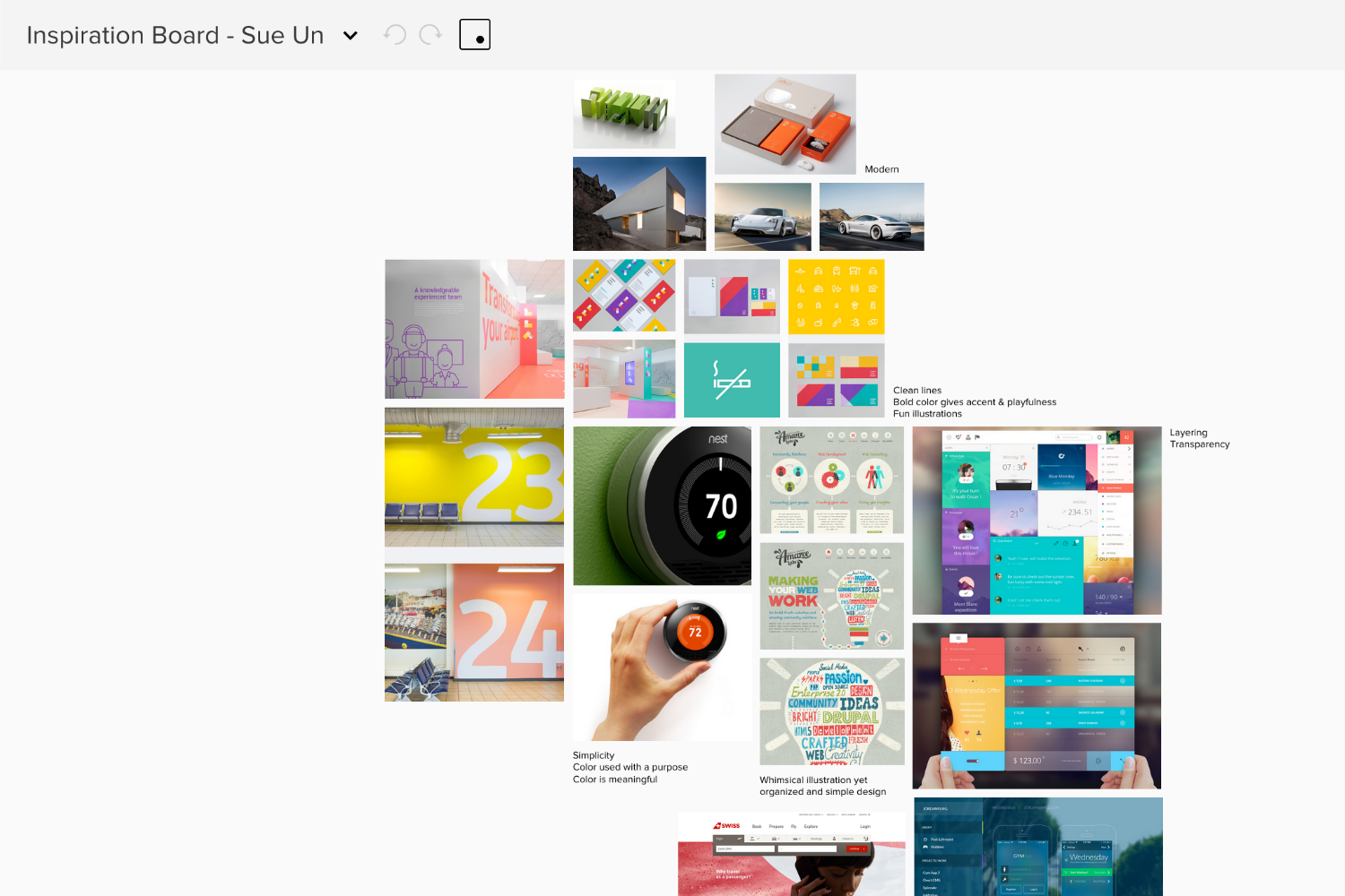
Each team member had the opportunity to create a mood board from things that inspired them or things they saw in the world. Mood boards helped us define the style we wanted this design system to communicate. We landed on these 7 principles to continue to validate our patterns throughout the life cycle of the project.
Personal
Playful
Dimensional
Focused
Organic
Valuable
Cohesive
Here's the mood board I came up with:
Interface Inventory
In the next phase, we collected an inventory of all UI patterns that we were using across all the products from past and current projects and created a mural board. It was a good exercise to see what was available today and what we wanted to prioritize in the new design system.
IA/ Site Map
With my mobile expertise, I helped define how mobile components could fit into the overall structure and framework of the site.
Style Tile
Based on the core design principles and research, 5 different look-n-feel style tiles were created to form the direction. The styles tiles included typography, color, sizing and spacing and general interface elements. Each design was tested for the following:
"Easy to read"
"Familiarity to brand" (IBM like)
"Visually appealing"
"Intuitiveness"
"Comfortable to use daily"
Final Style Tile Selected
Element Collage
From the top style tiles selected, element collages were created. Each style was applied to the same set of components (tabs, list view, business card, notifications, and etc.) to see how they would work in real product examples. This was a good way to test concepts, styles and design assumptions.
Design Kit
After iterations of user research, the master style was defined and used to come up with the final typographic scale, grid, color palette and spacing and sizing guidelines for the design system.
A sketch library of symbols were created for designers to use and was continuously tweaked and fine-tuned. I was one of the first users to incorporate these patterns into my People App and was able to give feedback to the team as to what was working and not working.
Sketch Design Kit
Final Patterns & Coding for Reuse
Once the master style has been defined, I have helped the Design Guide team to design the mobile patterns and started documenting the guidelines. Each pattern was coded for reuse by the front end developer.
IBM had an over arching design system in place called Carbon. Carbon is IBM’s open source design system for products and digital experiences. We were able to leverage the working code to stylize the components so we didn’t have to start from scratch. However, mobile components were lacking in terms of research and design.
Here's a snippet of some of the patterns I created:
Mobile Login Pattern
Mobile Login Pattern
Mobile Tour Pattern
User research was a big part of the process to define design directions for some of these patterns. Here's an example of a tour design I did using an illustration vs. snapshot style.
The final design of mobile tours ended up looking like below.
Some Other Patterns
There were many different mobile patterns defined throughout the sprints and I was fortunate to test them out in the product that I was working on at the time.
Mobile Documentation
And then we slowly documented these patterns and usage to share with our group.
Lessons Learned
It was a great experience to learn the making of a design system from start to finish. Some lessons learned were:
Start small and iterate
Instead of starting from scratch, consider adopting an existing system if it provides enough flexibility to make it your own
Have a small core team and pull in resources as necessary
