vSTART Branding
vSTART (Ventera's Scaffolding, Templates, Artifacts and Release Tookit) is a comprehensive portfolio composing of a technology platform, UCD+Agile+Strategy playbook, design artifacts, and more. It is made up of Ventera’s collective experience, wisdom, ingenuity, and thought leadership. I had the privilege to lead our design team to ideate and create a brand identity for this effort.
Company: Ventera
My Role: Design Lead
Team: 3 Designers
Duration: 3 months
Being involved in UX and product work, I rarely have the chance to work on branding. This was an exciting opportunity for me to come up with my own design process and work with a remote team to flush out the brand mark from conception to final product. I used Miro, an online collaboration whiteboarding tool, to document the process and walk through step by step in creating the brand mark from start to finish.
Ventera Rebrand & vSTART Overview
Ventera Rebrand
As we began the vSTART branding project, there was a parallel rebranding effort that was happening simultaneously. Ventera was going through a rebrand, so it was important to understand its vision and brand messaging to make it pair well with the company brandmark and make it feel like a family.
vSTART Overview
vSTART is a product that encompasses three verticals, playbook, design and platform and will be utilized in sales, so it’s easier to “brand” as a product
vSTART will be referred to in proposals, sales deck, sales 1-pager or brochure as vSTART’s flagship product
vSTART encompasses Ventera’s future vision
Playbook Inspiration
Competitive Research
I wanted to understand how other companies who have similar products are carrying out the branding within the company. I quickly realized that most companies were using the main branding for similar playbook products and did not treat them as a separate distinct product. The difference was that Ventera wanted to sell vSTART as a separate offering and it encompassed more than a playbook so a separate brand mark for the product was necessary.
Understanding
The next step was to hold a one hour workshop with the broader vSTART team to get them aligned in their vision about vSTART. I wanted to hear from the team members who were involved in vSTART what they knew about the product and ask the following questions:
Who is the target audience for the product?
What do you know about the product?
Where will it be used?
How would you describe the product?
What is the benefit of the product?
We did a 15 minute Mind Mapping exercise to lay out all of our understanding of the product so that everyone could be on the same page. This was important in defining the key messages of what we wanted the brand mark to communicate.
Mind Mapping Exercise
Messaging Exercise
Messaging
After the Mind Mapping exercise with the broader team, I had everyone write down on stickies what message they wanted vSTART to communicate. We spent about 10 minutes jotting down our ideas then grouped them by category and voted on our top 3 key messages. There was a tie between two categories, so we ended up with the following 4 key messages:
Speed/Agility
Ease of use - plug and play, building blocks, foundation
Forward thinking, dynamic, empower
Education and learning
The 4 key messages will serve as a basis when ideating on the brandmark.
Mood Board
As a last step of our workshop, I wanted the team to create a collaborative mood board of visual representations of the key words they came up with. I had them take screenshots from various sources and paste on the board for inspiration for the designers to ideate on. This was a chance for non-designers to exercise their creative freedom and envision what the brand mark represented to them.
Metaphor & Concept Exploration
Pen & Paper Sketching Exercise
Sketching & Voting
The next step was focused solely for the designers. I wanted them to take the traditional approach of using pen and paper to sketch out their ideas based on the key messages that were identified by the team and inspiration from the mood board. I asked them to explore the following:
Symbol
Graphic Image
Typographic treatment
Or combination of both
We gathered all the sketches and put them on the working board and had a collaborative working session. Everyone was given a chance to go through their thought process and give feedback to each other. And then with the remaining time left, we had another sketching session to sketch out more ideas. We were allowed to expand or improve on other ideas or come up with something completely new.
Some of the concepts that we gravitated towards were:
the roundedness of shapes that tied back to the Ventera word mark
simplicity of shapes
arrows that communicate forward thinking; directional; fast forward
north star - compass metaphor
check mark
building block idea
speed, movement
concepts that would play well with animation
After discussing more, we had a voting session to narrow down on the concepts we wanted to take to the next step.
First Iteration & Voting
In the next phase, I had designers look for logo inspirations and research current design trends and styles. I wanted them to ask the questions like what was working and not working and what they liked about the ones they found. I also had the designers start on the digital renderings based on the concepts we narrowed down. They were also free to explore something new that inspired them along the way.
We went through the same discussion and feedback session we had previously and designers gave further feedback by putting stickies on the ideas that resonated most to them. These comments were to be used as a guidance to the stakeholders when they did their super voting.
Research Logo Inspiration
First Iteration of Our Sketches, Voting and Feedback
Super Voting 1
I didn’t want to wait too long to involve the stakeholders and get their feedback. I shared the board with the Head of CX and Design at Ventera and the Product Owner of vSTART to narrow down on the direction and provide feedback to move forward with.
The clear winners that paired well with the Ventera brandmark were:
The building block concept
The double arrows concept
The simple abstract card concept was the wild card
Second Iteration
In the second iteration, the building blocks, double arrows and abstract card concepts were explored further. For this round, I wanted the designers to experiment more with the colors that pair well with the Ventera color palette and bring some of the gradients into play when exploring colors. Some of the question I wanted them to ask along the way were:
Is it appropriate? – fits well for Ventera and their business
Is it distinctive? – stands out, but easy to recognize and memorize
Is it flexible? – works in different sizes and in various contexts
After more discussion and feedback, the building blocks and the double arrows were emerging to become two of the strongest concepts.
Super Voting 2
The stakeholders had similar feedback. The final concepts were nailed and we just needed to finetune some aspects of the logo. Here are some of the observations and feedback.
The thin gradient outline gave a very modern feel and was in trend with what was going on in the industry
The symbol needed to have softer corners to pair better with the Ventera brandmark
The double arrows and building blocks were in target with the key messaging we wanted to communicate
The lower case “vstart” wordmark was preferred but the color could be further explored
Last Iteration
For the final round, I created a template to explore the logos on varying background colors. In this round, I worked with only one of the designers to layout all the options on the template. I invited back the broader vSTART team to have them vote on their favorite option. Here were the criterias I had them vote on:
Message - Does it communicate the vSTART message?
Speed/ agility
Ease of use
Education/ learning
Forward thinking, dynamic, empower
Family - Does it feel like it belongs in the same family with the Ventera logo?
Roundness
Interwined success - overlapping pills
Color
Typography
Distinctive - Does the brandmark standout and easy to recognize and memorize?
Flexible - Is it working in various context? Is it scalable?
And number 3 and 4 were the winners!
The final stretch
As the last round, I put together a story behind each logo to sell to the marketing team and leadership at Ventera. Both directions were well received, but the message behind the building blocks logo were more aligned with the future direction we wanted to take vSTART. We finally found our winner!
Option A: Double Arrows
Double arrows are teams working together; teams and client merging into one unit; going in one direction - aligned in their vision. The circle signifies that the teams are working under one umbrella working towards a common goal. This logo is meant to be lightweight, showing that we are not slowed down by complex processes but vSTART helps kickoff projects and innovate faster and provide value with reduced time and effort.
Option B: Building Blocks
The blocks symbolize the foundation of VSTART. Each block represents a tech artifact, template, or process. The color shapes symbolize the collaborative nature of the diverse teams coming together. When put together, you could build something powerful and robust to solve the client’s most complex problem. The blocks are used to show flexibility. You can reuse the blocks to build the same structure but also innovate to create something completely new.
…and presenting our final logo

Final vSTART Logo
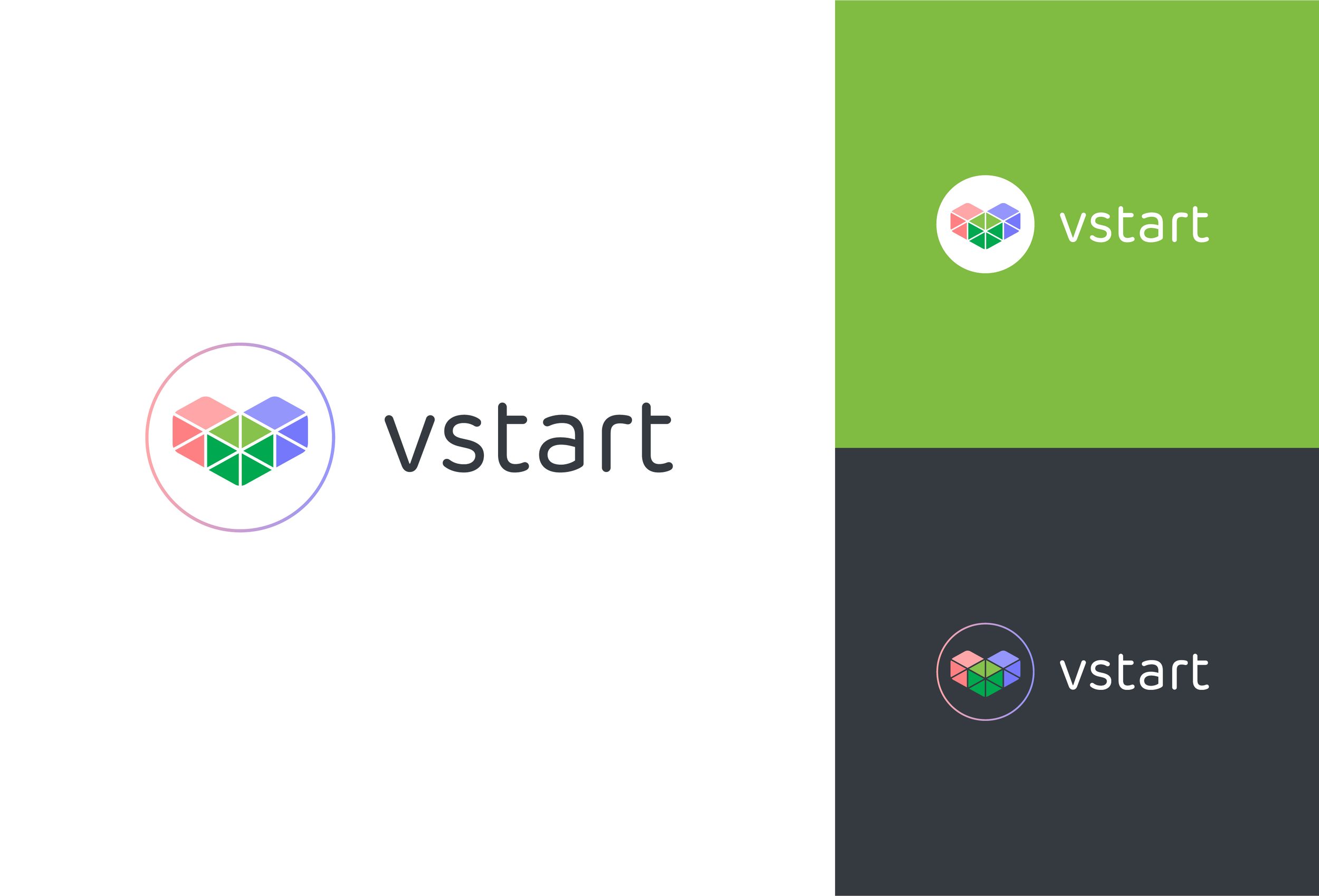
Final Logo on Various Color Background
Powerpoint Title Slide
Powerpoint Content Slide
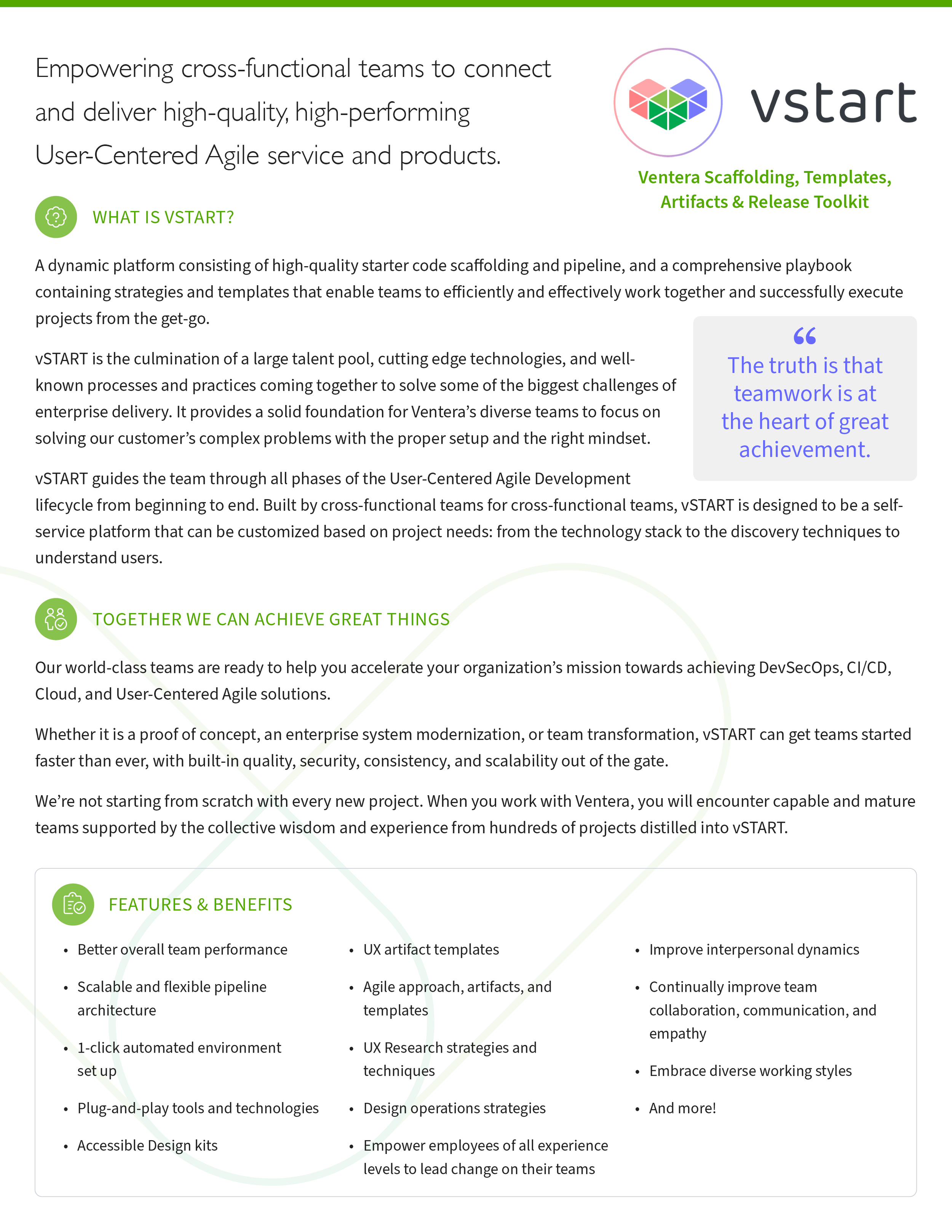
Word Template
T-Shirt Example