vSTART Initiative
Ventera's Scaffolding, Templates, Artifacts and Release Tookit (vSTART) is a quick service to build products and solutions for complex challenges or projects instantaneously. vSTART enabled teams to leverage reusable code, starter artifacts, baseline templates and methodologies to get projects and teams up and running. I had the opportunity to lead our vSTART UX team to develop the brand identity, UX templates and design kits for this effort.
Company: Ventera
My Role: UX Design Lead
Team: vSTART User-Centered Design (UCD) Team (2 Researchers, 3 UX Designers, 1 UI Developer)
Overview
Problem Statement
Before vSTART, there was a huge delay on the delivery of our solutions:
Teams had to reinvent the wheel every time they started a new project which resulted in longer release cycles
There was no reusable code or process to work with initially which caused longer start times
The quality and consistency suffered due to lack of standards, best practices and recommendations
There was longer training and onboarding time on projects
Projects overall encountered scalability and performance issues
Outcomes
The outcomes our team focused on was:
To enhance performance, quality and efficiency in the delivery of our solutions
To improve team collaboration, communication and empathy
To reduce training and onboarding time
vSTART UX Templates
Over the course of three months, I led the research and design team to brainstorm, wireframe and build 12 UX templates that Ventera can leverage in various workshops, challenges, and projects. Due to COVID and all our team members being remote, Miro was a great collaboration tool to get everyone's idea out on the table, give feedback, iterate, and come up with the final solution.
Research
Like all efforts we started this effort with research. I wanted the team to collect different ideas and inspirations on UX templates. We discussed what was working and not working and what we wanted to customize for our particular needs. This is an example of the research we did for the Persona template. We did a dot voting exercise to select the features we felt that was most appropriate for Ventera’s needs.
Example of Persona Research on Miro Board
Wireframes & Iterations
Each researcher or designer was given a specific template to hone in on and create a wireframe of the template. We went through two rounds of discussion and feedback to finalize on the wireframes.
Example of Persona Wireframe
First Iteration of Persona Template
Final UX Templates
Once we had our wireframes flushed out the way we wanted, I designated one designer to look holistically across the templates and come up with the final look and feel.
Some of the outcomes we focused on when creating the final template were:
Templates need to be quick to update and easy to use - use of default colors, fonts and native shapes, make items easy to add, move or scale when needed
Provide enough flexibility to customize the template to fit the project, challenge or workshop need
Provide an option for low fidelity templates to use on Miro for remote users or high-fidelity templates to print for in-person workshops
Give enough direction so that any one new could just pick up and start running with
Final Persona Template
Testing & Maintenance
Testing these templates in real projects and challenges was a key to fine tuning these templates. We quickly realized that our Miro templates needed to be further simplified to fit the fast paced nature of remote collaboration. There were few extra items on the Miro templates that were not necessary like the template description, header and footer which we ended up removing. The header and footer area were left in the hi-fidelity version however to print for in-person workshops.
Updated Final Persona Template - Miro Version
Final Blank Persona Template - Hi-Fidelity Version in Adobe XD
Post Enhancements
As one of the enhancements after all templates were created was to create a library of persona illustrations to use with our Persona template. Some of the goals we wanted to focus on were:
Create a more business appropriate persona library
Create components with facial structure, hair, clothing, and accessories to change out to customize the illustrations
Create personas with no facial expressions
Come up with a color palette that will work with our new Ventera brand
This is the template we came up with. Persona illustrations could be built and customized by gender, facial structure, skin color, hair style, clothing and accessories. Each component were built as a symbol in Adobe XD and switched out easily with a click. You could build and export the illustration in minutes.
For those people who did not have the patience to build an illustration, we also had a library of persona illustrations to choose from. Here are just a few of the combinations that were created with the components above.
Pre-made Persona Illustrations
vSTART UX Templates
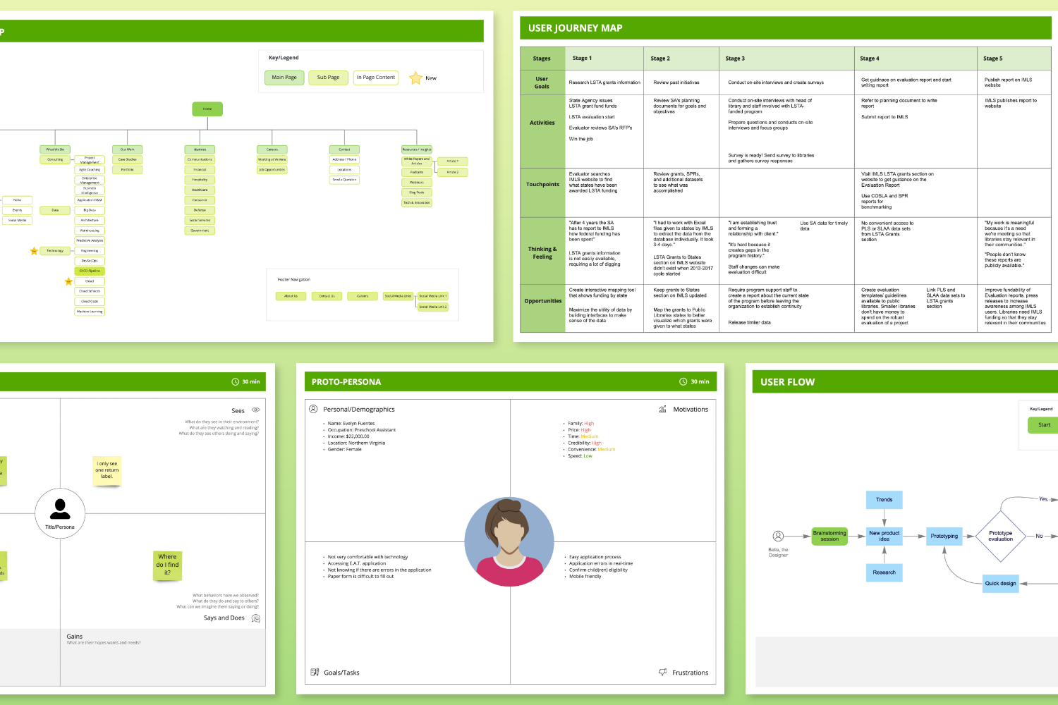
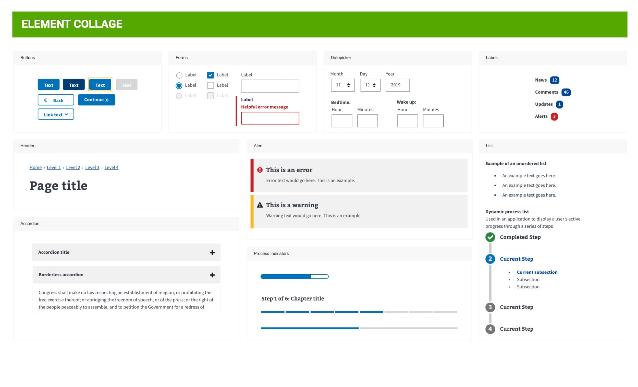
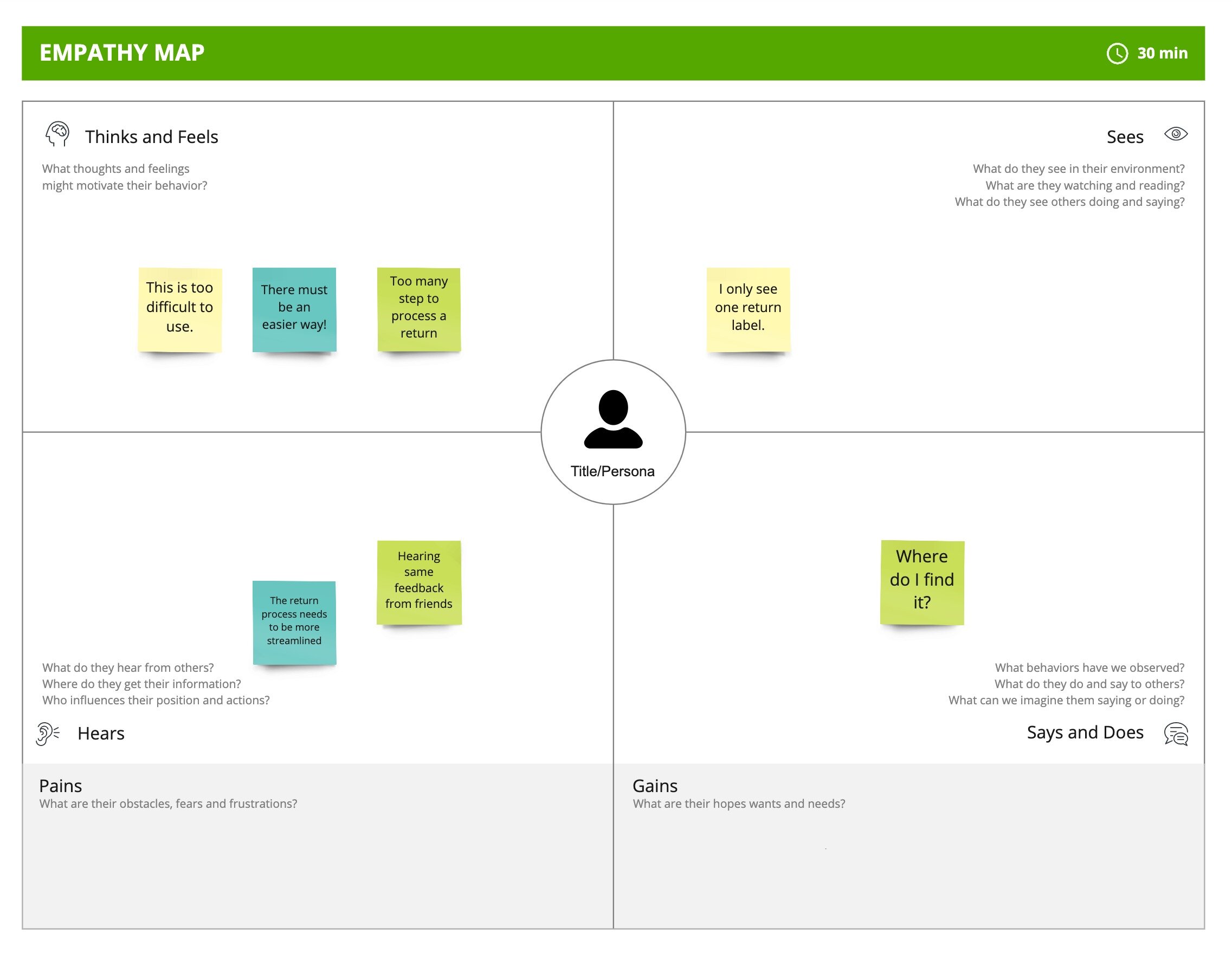
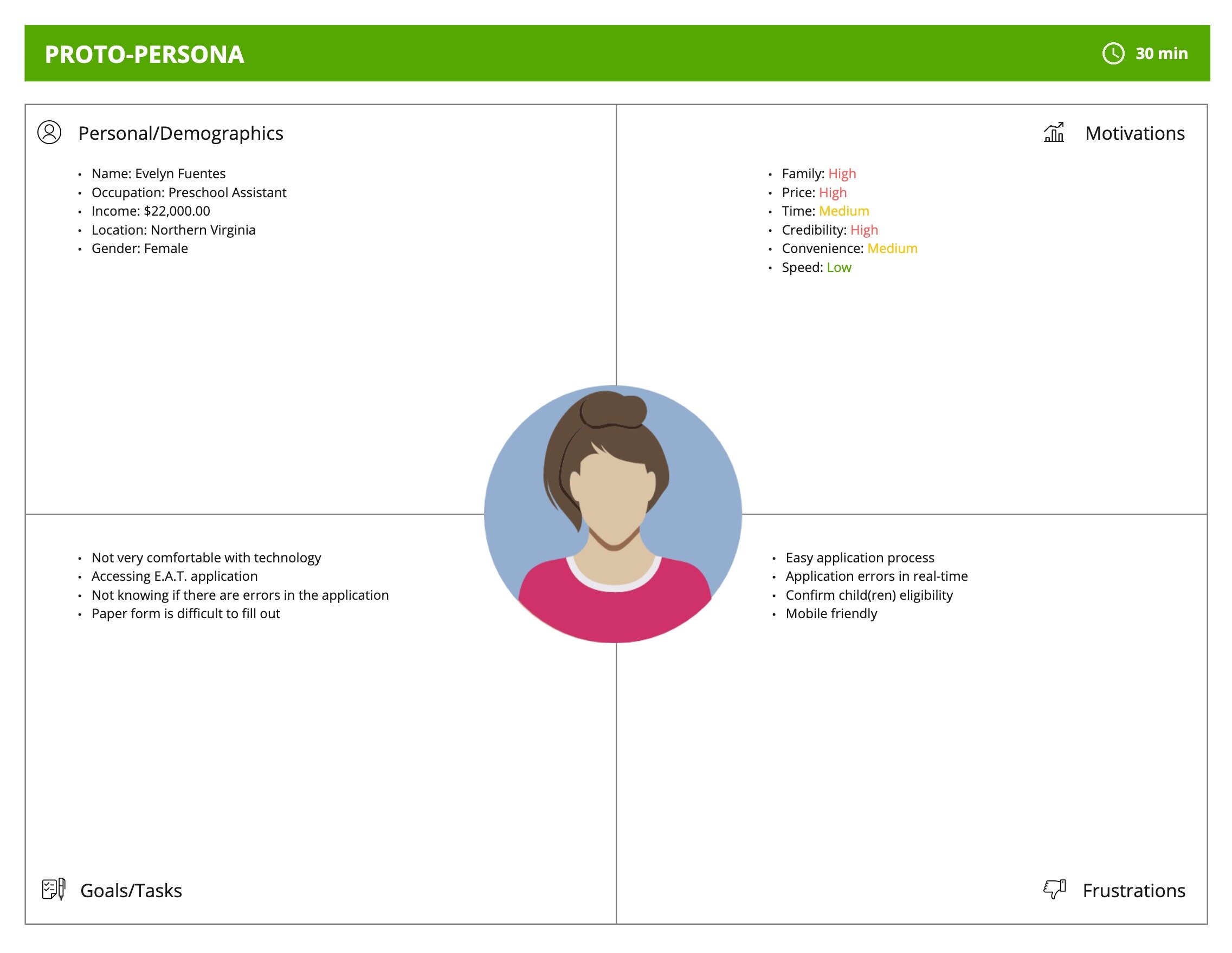
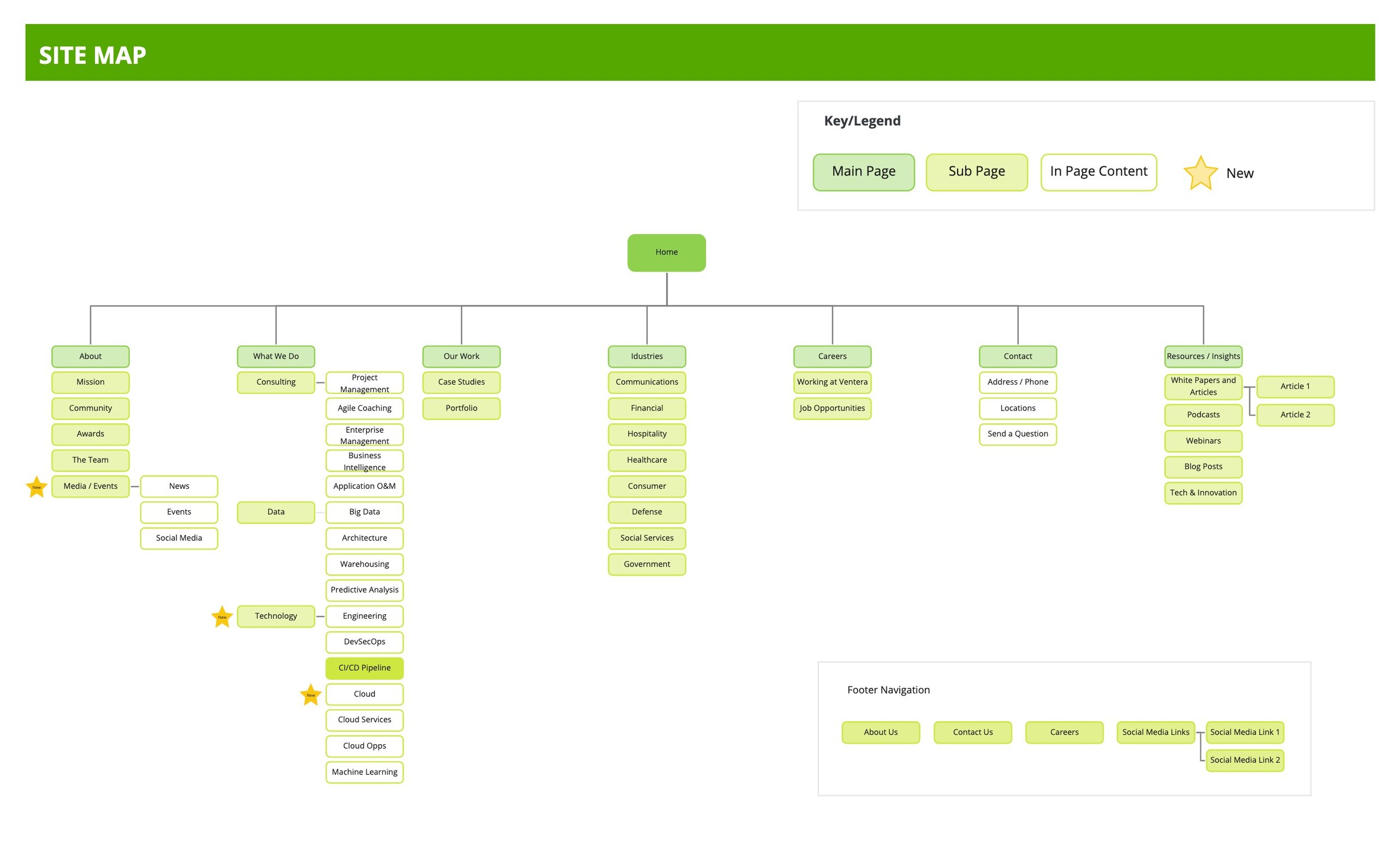
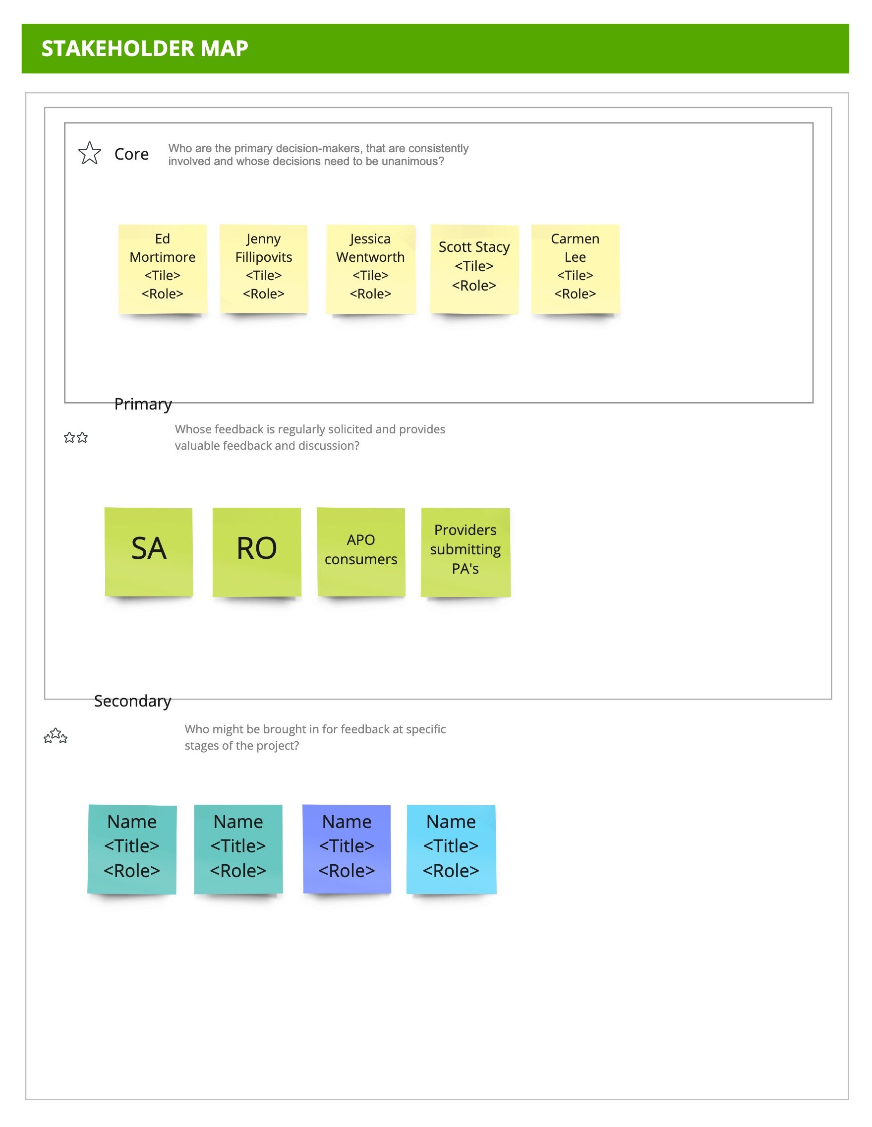
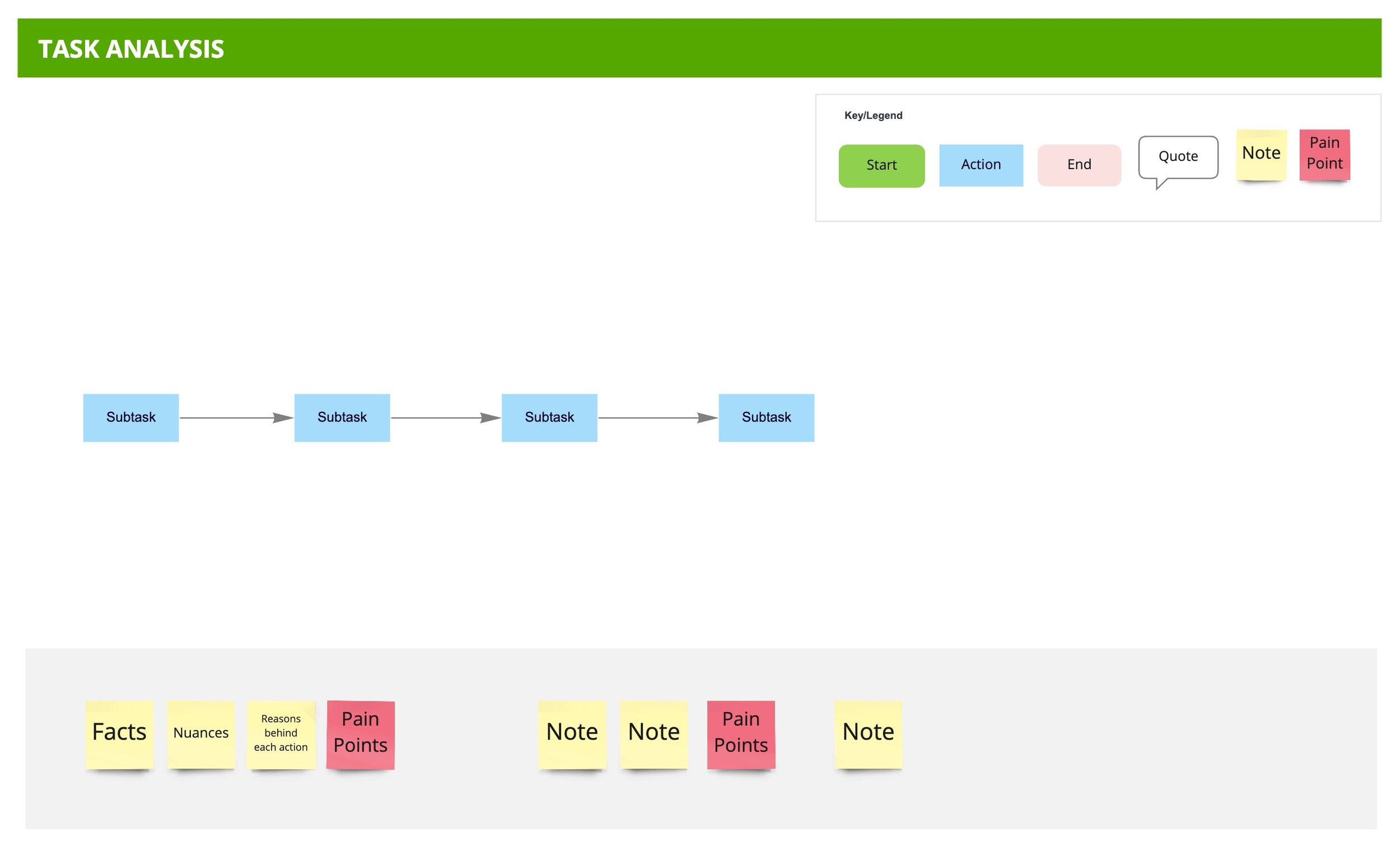
And here are all the Miro templates we created.
Element Collage
Empathy Map
Heuristic Evaluation (in MS Excel, not included)
Proto-Persona
Persona
Site Map
Stakeholder Map
Storyboard (not included below)
Style Tile
Task Analysis
User Flow
User Journey Map



vSTART Design Kit
iQIES Design Kit
One area that our design team could collaborate more efficiently on was to start from a common component library that could be used for tech challenges and various projects. I worked with a team of 3 designers and 1 UI developer to implement an accessible design kit, one for government use and one for business use. The government design kit was based off of the US Web Design System (USWDS) colors and typography.
We built these design kits with the following outcomes in mind:
The components in the design kit needed to be fully accessible
The components we created needed to be easy to update and fully scalable
The design kits needed to be built in different tools to satisfy different project requirements
Research the Competition
When researching other reputable design kits on the internet, one thing that I was surprised was how poorly those design kits were constructed.
There was lack of organization in the design kits I've researched and downloaded.
Not all components were built using symbols or had a strategy to organize them.
The design kits I researched were half baked solutions lacking the flexibility we needed.
Share the Knowledge
Being involved in different Design System/ Design Kit efforts in the past led me to come up with my own best practices to share amongst our design team. Here are just a glimpse of some points I shared with the designers:
Consider the use of Design Tokens
Apply color and character styles to your components
Use smart naming conventions
Leverage symbols in Sketch or the component feature in Adobe XD
Plan the structure of the symbols/components before building
Simplify the symbols in the override panel
Make components responsive
Make your design kit a Library
Designate one or two people to maintain the master file
Build the Design Kit
The design kit was built based off of the bootstrap components. We started building the bootstrap design kit for commercial clients and then applied the US Web Design System (USWDS) principles to build the USWDS design kit for government clients. Both were built in Sketch and Adobe XD. I created the master design kit and I led the designers to follow the same process:
Start an inventory of the components used in the product and prioritize
Start defining the color and typographic styles
Create components in alphabetical order
Group similar components and come up with intuitive naming conventions so that components are easy to find
Make common components into symbols that could be reused and updated easily
Review design kit file with designers and developers for quality control and accuracy
Save out the file as a library to disseminate to the entire team
Once the design kits were published on the cloud, we were able to leverage the design kits in various projects and technical and design challenges to refine and tweak areas that didn't work so well.
What Users Are Saying
“Having UX templates available like the User Flow Diagram helped us jump into creating the user flows in just seconds without having to worry about all the details that surround creating a diagram from scratch.”
— Product Designer
“Using the [persona illustration] template cut down my time from hours to minutes. I didn't have to reach out to anyone else for help and I didn't have to spend time looking for royalty free illustrations that I can both use and fits the attributes of my persona.”
— Product Designer
“Having the design kit available helped save time tremendously. We didn't have to spend time creating standard components like input fields, tables, alerts and buttons or figuring out the color palette or typography but rather our time was focused on coming up with a solution.”
— UX Designer
Outcome and Results
Creating the vSTART UX templates and design kits for Ventera was a big win for our company. We experienced the following benefits:
Reduced project set up and process definition time from 1-2 weeks to 1-2 days
Enabled team members to learn and implement a new technique faster by 50%
Reduced time to create prototypes from 1 days to 1-2 hours using the Adobe XD and/or Sketch design kits
Improved consistency and alignment in designs across multiple designers
Saved time by 50% by using customizable templates to create UX artifacts, enabling teams to quickly move to the next phase/outcome
As with all efforts, continuous maintenance and improvements to these design artifacts was the key to success in our future endeavors.